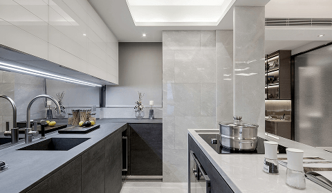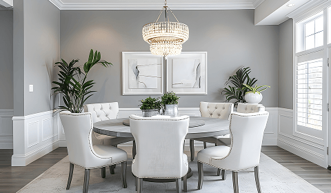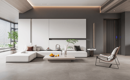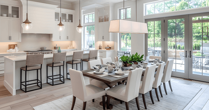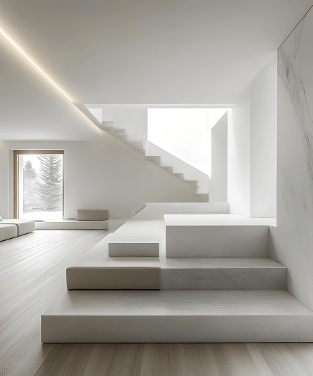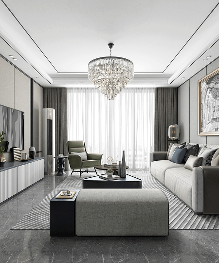
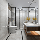
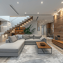
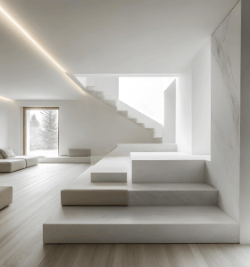

We specialize in transforming visions into reality.
Explore our portfolio of innovative architectural and interior design projects
crafted with precision.
Dream it, we’ll design it! From big picture layouts to the tiniest details, our architectural magic brings your ideas to life with creativity and precision!
Dream it, we’ll design it! From big picture layouts to the tiniest details, our architectural magic brings your ideas to life with creativity and precision!
Dream it, we’ll design it! From big picture layouts to the tiniest details, our architectural magic brings your ideas to life with creativity and precision!
Dream it, we’ll design it! From big picture layouts to the tiniest details, our architectural magic brings your ideas to life with creativity and precision!
 Latest technologiesHigh-Quality Designs5 Years WarrantyResidential Design
Whether it’s your home, office, or a commercial project, we are always dedicated to bringing your vision to life.Our numbers speak better than words:
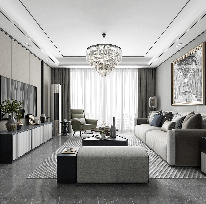
We specialize in transforming visions into reality. Explore our portfolio of innovative architectural and interior design projects crafted with precision.
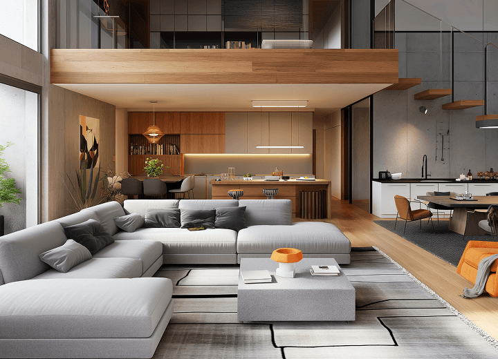
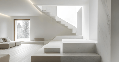
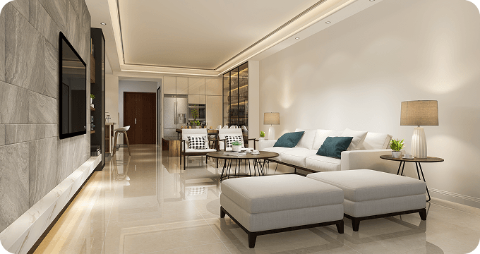
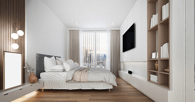
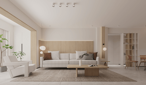
Tailored design services for private homes, including room makeovers and complete home transformations.
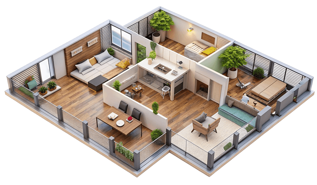
Improving homes with expert
craftsmanship for years
Improving homes with expert
craftsmanship for years
Improving homes with expert
craftsmanship for years
Improving homes with expert
craftsmanship for years
Our process is alive - adapting, refining, and growing
with your vision. Always.
Like artists with a blank canvas, we transform rooms
into living works of art.

We begin by understanding
your vision, goals, and needs,
followed Antra.

We begin by understanding
your vision, goals, and needs,
followed Antra.
We begin by understanding
your vision, goals, and needs,
followed Antra.
We begin by understanding
your vision, goals, and needs,
followed Antra.
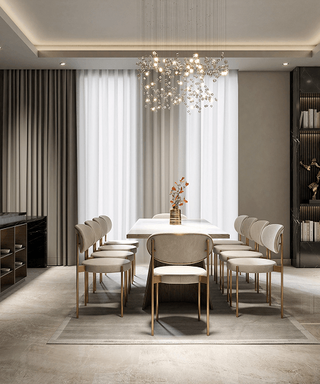
Our portfolio showcases a diverse range of projects, from beautifully crafted
residential spaces functional and stylish commercial interiors


From concept to reality, the team turned my
vision into a stunning, livable space. I couldn’t
be happier with this!
“A wonderful experience! They knew what they were doing and were incredibly knowledgeable throughout the process."